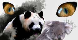
>>239308Unnecessary sharp points above M in Mega and N in Therion. Unnecessary cut next to T. Make them solid squares, it will be cleaner.
Sharp typography does not match squiggly and soft sign.
Typography needs better kerning.
No order or relation for proportions of the elements.
Unrefined lines make the sign look messy.
No order or thought when it comes to lights within the sign. I presume the things are horns and that little blue space makes it look even messier make it black like the contour when there is so little space between objects..
3/10
Needs work.
